


Auditing digital experiences against WCAG 2.1 AA standards
As part of a global activewear brand’s digital modernization, I conducted a comprehensive WCAG 2.1 AA accessibility audit. The goal was to ensure that all major pages and components from homepage to checkout provide equal access to customers, regardless of ability.
Project Date: 2024
My Role: Accessibility UX Designer
Scope: Homepage, PLP, PDP, Mini-cart, Cart, Checkout
Deliverables: Full audit with prioritized issues, WCAG mapping, and recommended fixes
The audit followed a systematic 4-step process:
1. Component-Level Review: Buttons, navigation, forms, modals.
2. Page-Level Review: Homepage, product listing pages, product detail pages, cart, and checkout flows.
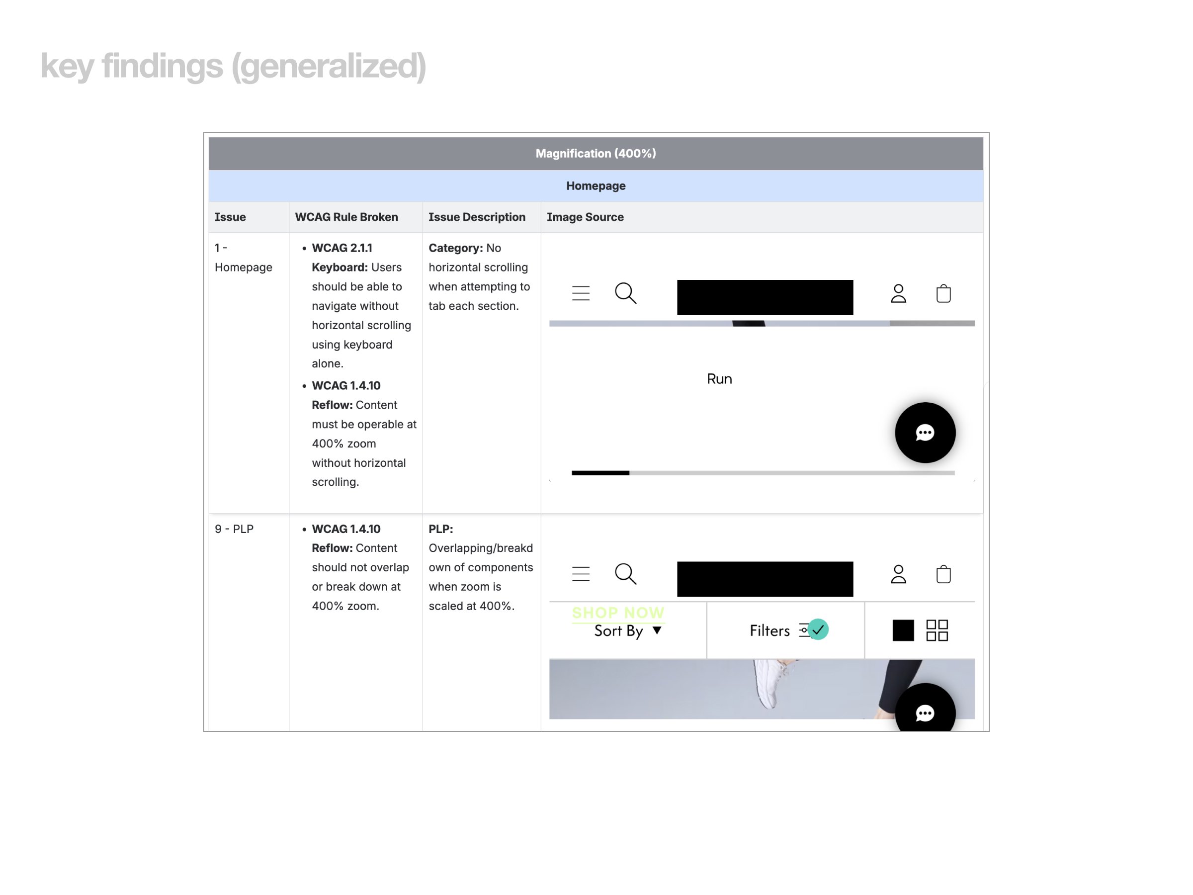
3. Assistive Tech Testing: Keyboard-only navigation, screen readers, 400% zoom.
4. Documentation: Each issue mapped to WCAG guideline, with description and suggested fix.
Keyboard Navigation Issues
1. Dropdowns, carousels, and size selectors were not consistently operable via keyboard.
2. Some modals created keyboard traps (e.g., users could not exit with Tab/Escape).
3. “Add to Bag” sticky elements blocked content when zoomed at 400%.
Contrast & Visibility
1. Several interactive elements (buttons, product cards, size selectors) failed minimum contrast ratio (4.5:1).
2. Hover/focus states were missing or invisible on some CTAs.
Focus Order & Indicators
1. Inconsistent focus order made navigation unpredictable (e.g., focus jumping to the top of page after a filter action).
2. Focus outlines were often faint or hidden behind layers.
Alternative Text (Non-Text Content)
1. Many product images, icons, and buttons lacked descriptive alt text or voiceover labels.
2. Screen readers announced vague details like “Image” instead of describing product features.
Form & Checkout Accessibility
1. Labels for input fields were missing or unclear.
2. Some express payment buttons were skipped entirely during keyboard navigation.
3. State and delivery dropdowns were cropped at high zoom, making them unusable.
1. Keyboard: Ensure all interactive elements are reachable and operable via keyboard (Tab, Enter, Arrow keys).
2. Contrast: Update color palette tokens to guarantee WCAG AA contrast ratios.
3. Focus: Standardize visible focus indicators across all interactive elements.
4. Alt text: Add descriptive alt attributes for product images, icons, and buttons (not just “Image”).
5. Forms: Properly label all form inputs with ARIA and descriptive text.
6. Sticky elements: Prevent sticky UI (like chat buttons or add-to-cart) from obstructing content at zoom.
The impact will increased compliance with WCAG 2.1 AA across core e-commerce flows. Improved usability for customers relying on assistive technology. Created a scalable accessibility checklist for future design and development.
This audit revealed how seemingly small issues like missing alt text or hidden focus outlines have outsized impacts on accessibility. By approaching accessibility as a design quality metric (not just compliance), I was able to elevate the overall user experience and set a foundation for inclusive design practices going forward.
Confidentiality Disclaimer: Certain details and visuals have been modified for confidentiality. The insights presented reflect my UX process and accessibility methodology, not proprietary company data.