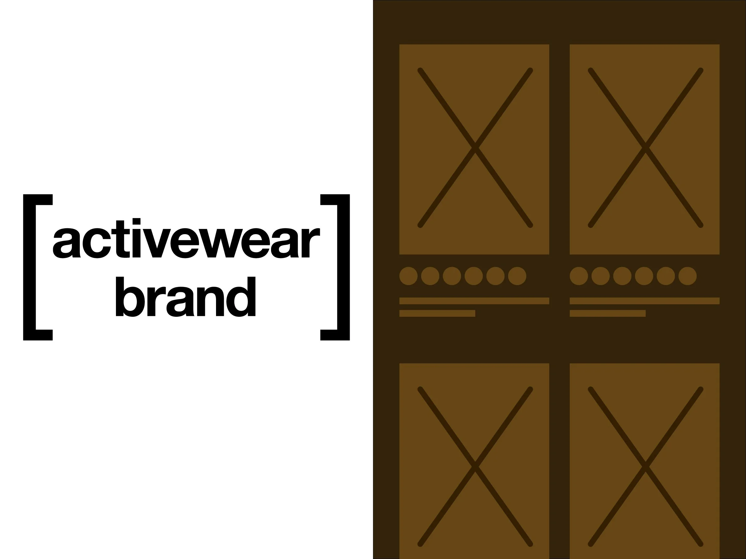
PLP Color Swatches Optimization

PLP Color Swatches Optimization
Enhancing product discoverability and user confidence through research-driven iteration.

Project Overview
A global activewear brand noticed inconsistent engagement with color swatches on its product listing pages (PLP). Some users easily understood how to explore product color options, while others were unsure how to view more choices. My goal was to optimize the color swatch experience to make it more intuitive, efficient, and accessible across devices.
Project Date: 2025
My Role: UX Researcher & Designer
Project Duration: 4 weeks
Team: UX
Methods: Competitive analysis, user survey, unmoderated user testing
Deliverables: Research findings, prototype variations, final design recommendations

Phase 1: Competitive Analysis
To ground our work, I conducted a competitive analysis of top retail and apparel websites. Most competitors displayed between 4–8 color swatches and used a “+Number” indicator (e.g., “+6”) to represent additional options. Common interaction patterns included:
1. Hover or tap to update the product image instantly.
2. Expandable “+Number” indicators for inline interaction.
3. Carousel-based solutions on desktop, limited color previews on mobile.
From this, I recommended a hybrid model: show 4–6 swatches by default and allow inline expansion for more colors for balancing visibility and performance without overwhelming users.


Phase 2: Quantitative & Qualitative Survey
Next, I conducted a quantitative user survey with 25 participants to assess whether users understood the current color swatch behavior. Key findings included:
1. 95% correctly recognized the swatches as color options.
2. 85% expected the image to update when a swatch was selected.
3. Nearly all users understood “+6” as “more color options,” but a few were unsure whether it would expand inline or open a new page.
These insights informed clear design next steps by adding affordances (like a chevron or tooltip “View more colors”), improving contrast, and maintaining context within the PLP to support accessibility and predictability.


Phase 3: Format Usability Test
To identify the optimal approach, I ran an unmoderated usability test with 9 participants. Three prototypes were tested:
1. Option A: Show all color swatches upfront
2. Option B: Show a few, open all on a new page
3. Option C: Show a few, expand inline to reveal more
Results revealed a strong preference for Option C, which users described as “balanced,” “clear,” and “just right.” It gave users enough information to explore without cluttering the page or forcing unnecessary clicks.


Design Outcome
Based on user feedback, the final solution standardized Option C as the default swatch layout:
1. Display 4–6 swatches by default with a visible “View More” affordance.
2. Enable inline expansion rather than opening a new page.
3. Optimize swatch size for clarity of patterns and shades.
4. Ensure full accessibility support through proper labels, focus states, and contrast.
This refined interaction model increased user confidence in browsing color options and established a scalable pattern for future cross-brand design consistency.

Reflection
This project reinforced how small interface elements can significantly impact user experience and perception. By combining competitive benchmarking, quantitative validation, and qualitative testing, we delivered a design that feels both simple and smart. It was clear to new users while efficient for returning shoppers.
Confidentiality Disclaimer: Certain visuals and details have been modified for confidentiality. The insights presented reflect my UX process and design thinking, not proprietary data.
